LiveVoice
Updated UI design of LiveVoice’s participant/speaker mobile app — a live multilingual interpretation product. Part of the bigger release, this mobile UI update was needed to share consistent visual language with the web app. Designed participant and speaker interfaces and core user flows, proposed a new multi-speaker handover interaction, and extended the shipped redesign’s visual language to App Store and Google Play presence and marketing.

This redesign ran alongside a parallel, larger effort, which covered the web app v5 redesign. LiveVoice started as a relatively simple tool for real-time translation, which over the years evolved into a much more advanced and professional tool for multilingual events, AI-powered voice translation, live captions, and complex event operations. The redesign of the web app had a goal of simplifying an interface that had become too complex over the years for event organizers.
The LiveVoice mobile app, on the other hand, is used by participants and speakers of these events. The app was intentionally easy to use, but needed to be updated in order to establish a consistent design language across the whole ecosystem.
The mobile app was kept relatively simple. However, as new features were introduced into participants’ and speakers’ flow (AI chat, language by demand, switching groups, etc.), it was getting apparent that the UI design has to keep up.
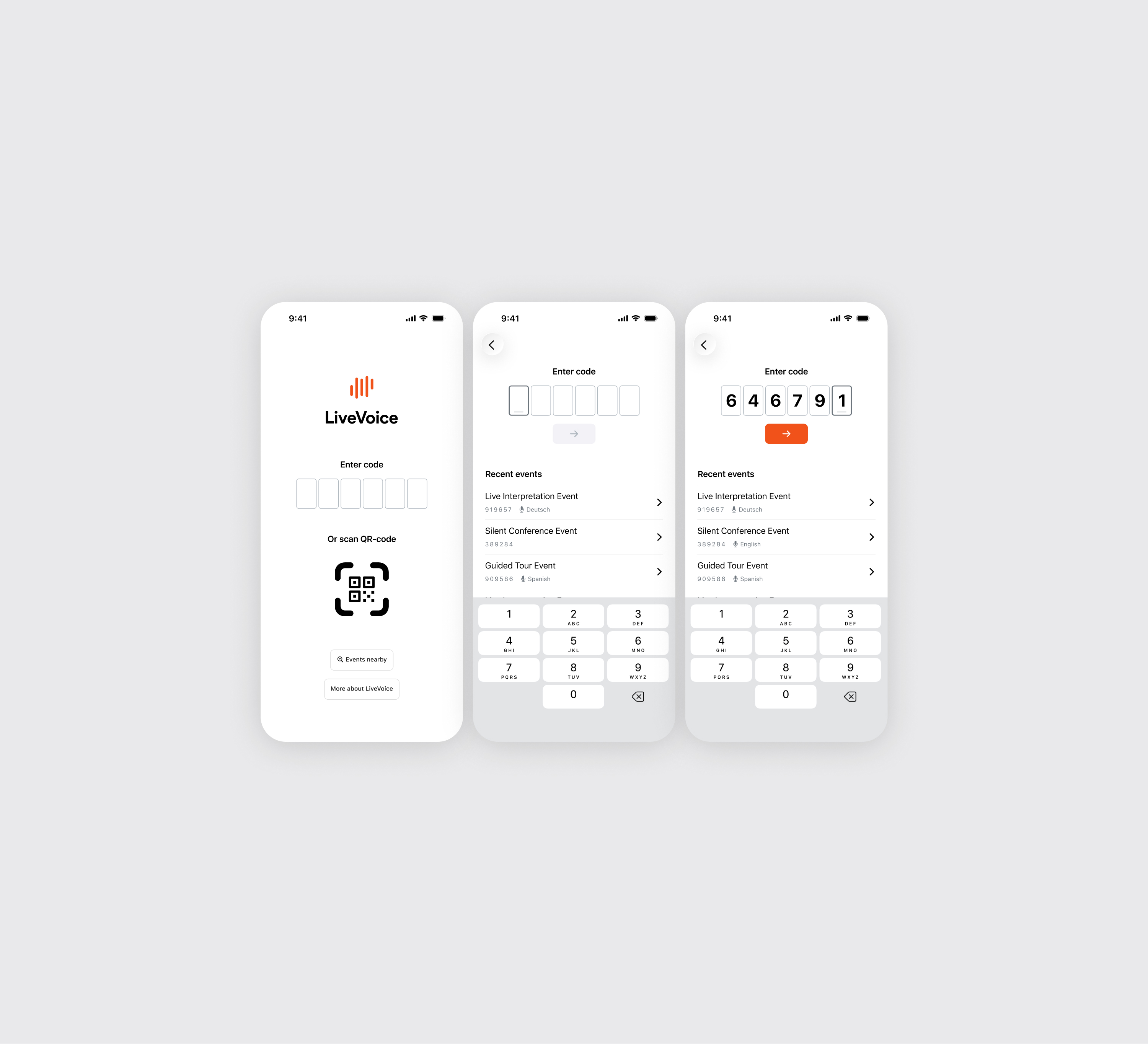
Join event flow. Updated the input code cells, changed the font, made the screen more readable. The recent events list also needed attention — previously it surfaced raw, unlabeled codes with no way to tell what any of those past events actually were. I redesigned it so people could recognize an event they’d already joined and get back into it with confidence.
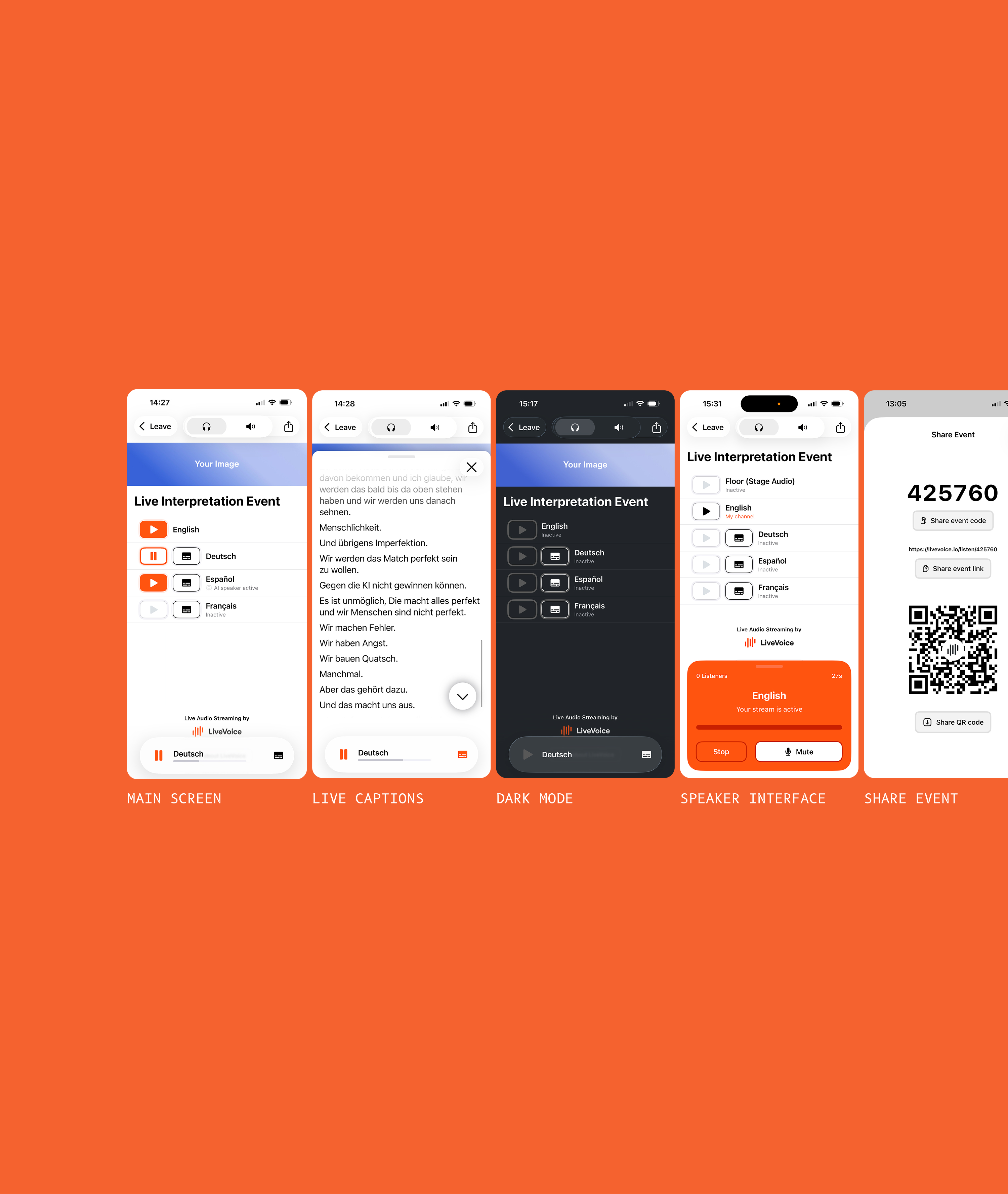
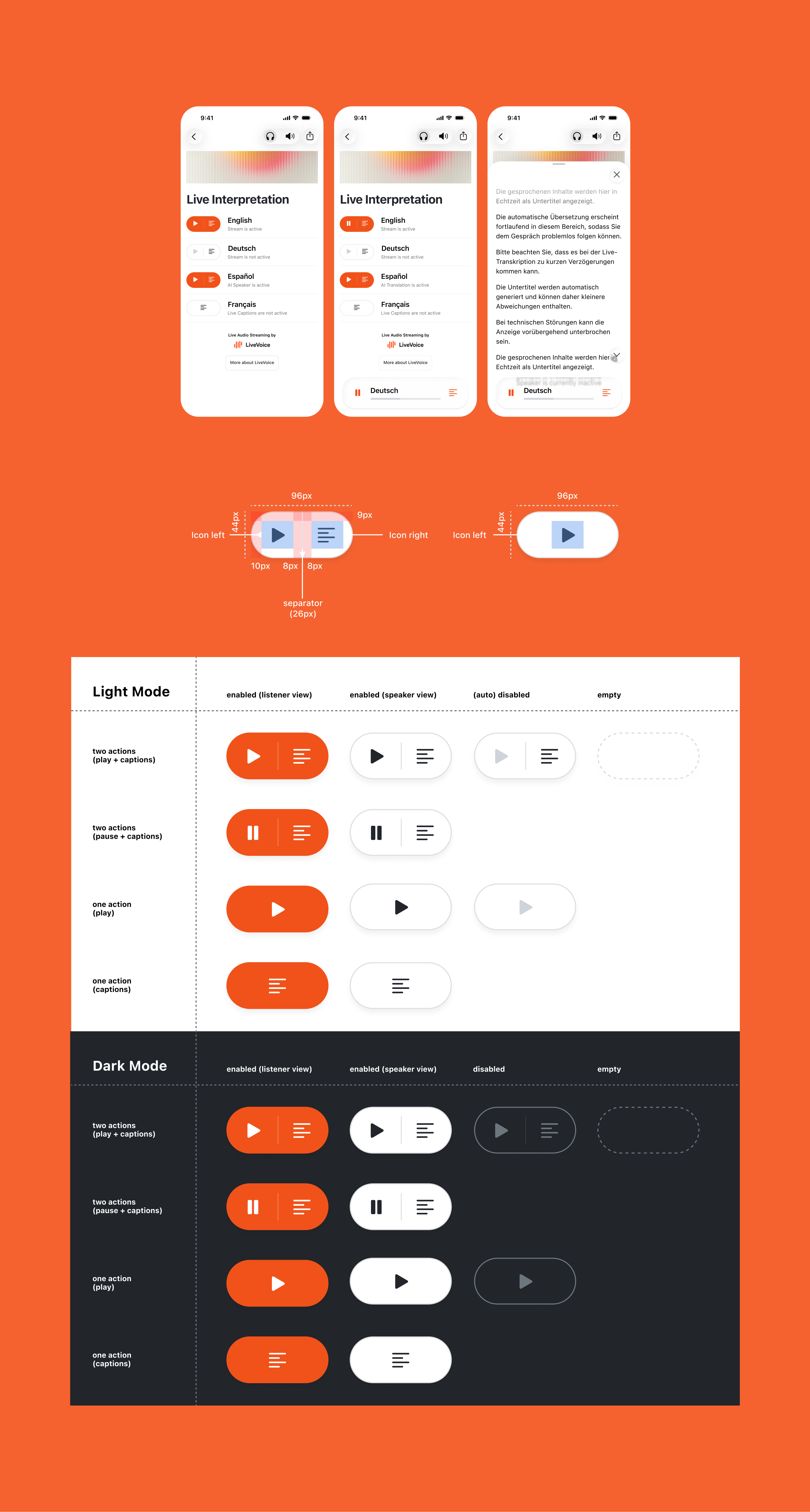
Listening flow. Updated the UI according to the new liquid glass iOS design standard, fixed the top bar, and prepared correct text styles. Also updated the play button for three different cases — audio only, captions only, both audio and captions — across three states: playing, not playing, and disabled.
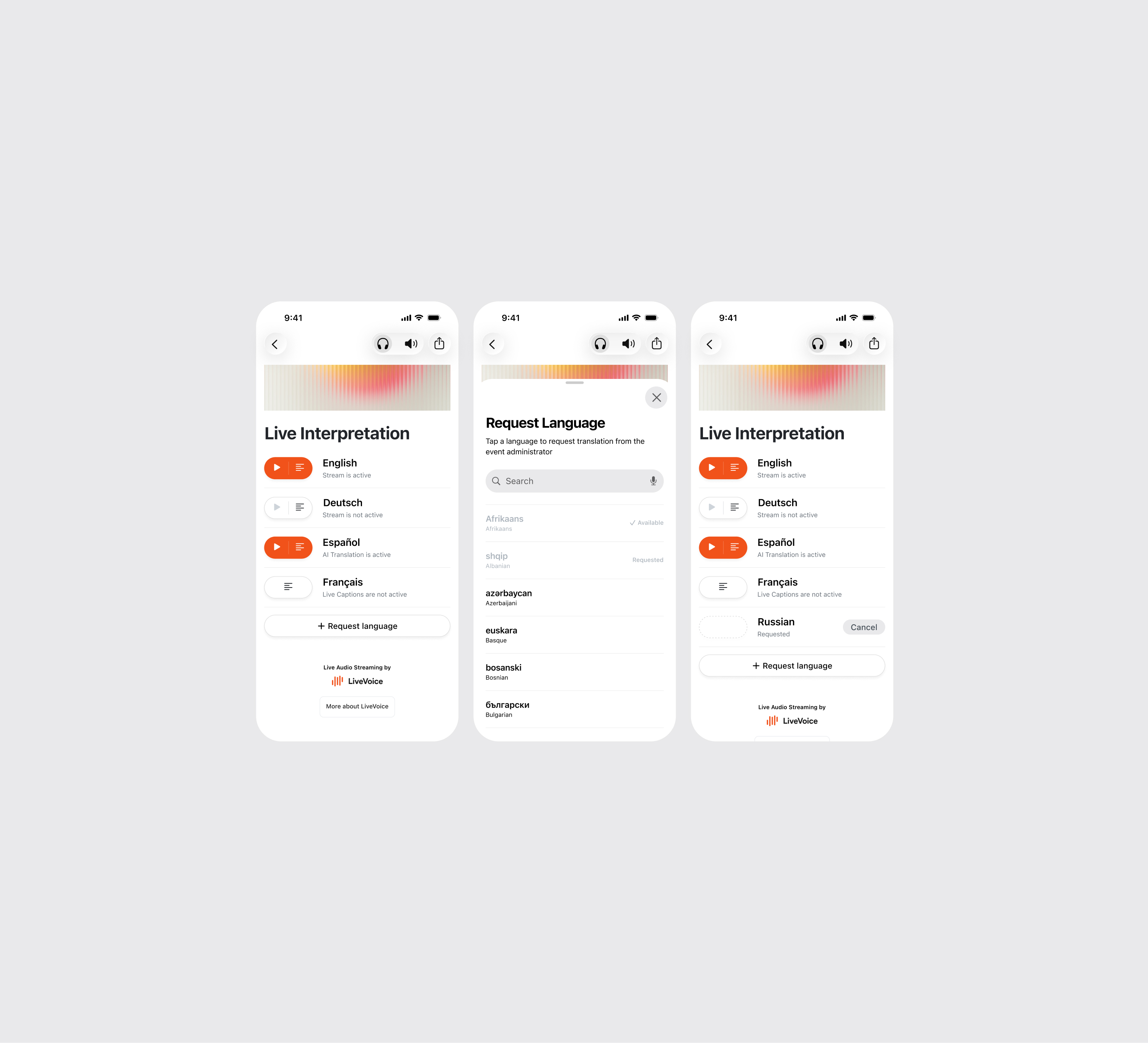
Request a language feature. Proposed different ideas for a user flow. The business requirement was to prevent people from requesting more language translations than they require just because the interface allows it. Also, languages that were requested or are available for listening had to be visibly disabled.
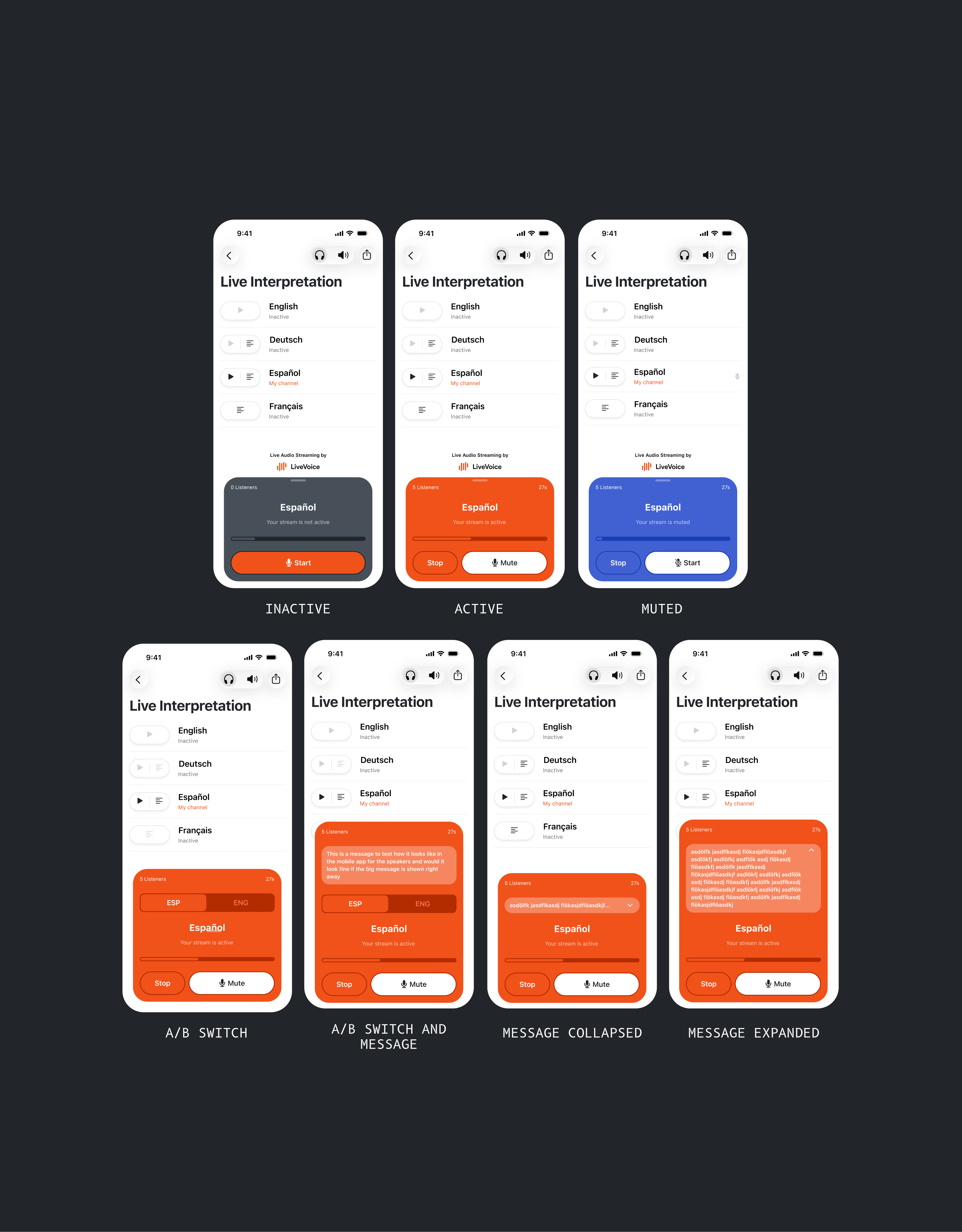
Speaker box redesign. Updated UI for all the states: inactive, active, and muted. Message for speakers now doesn’t overlap with other UI elements, but is expanded to the top.
The A/B switch that allows speakers to switch between different channels is also moved to the top, to not interfere with the main actions: start, mute, and stop.
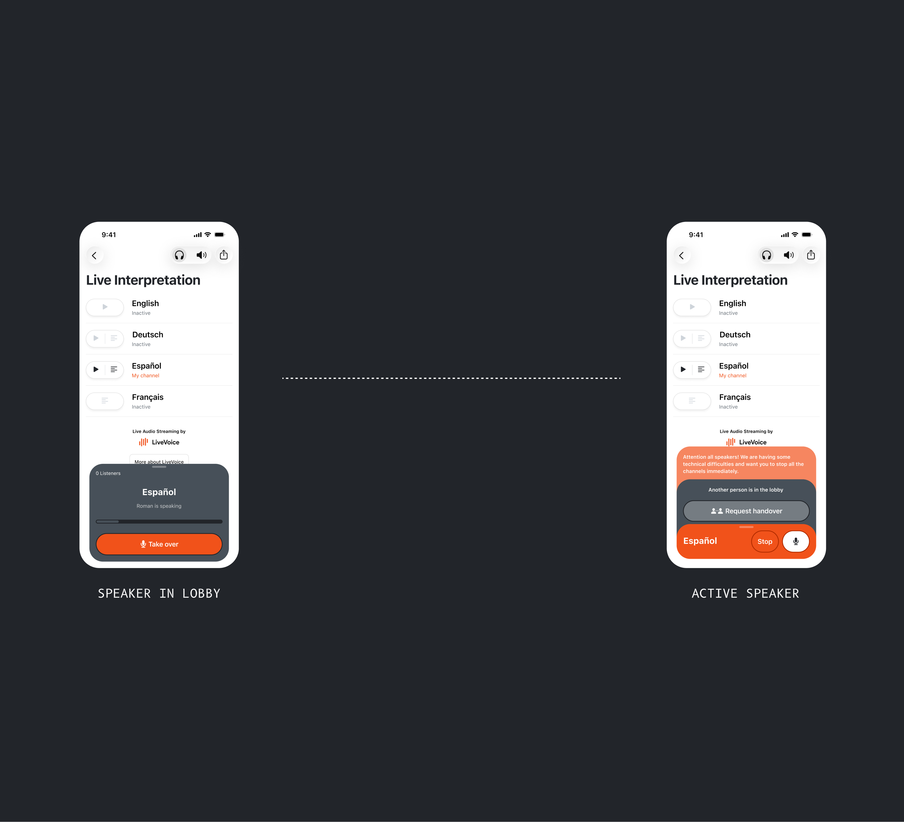
Speaker handover and takeover. There is a core feature where a speaker can request to take over the channel — the active speaker can accept the request and hand over. In the app it was implemented at the bottom of the box, crammed into a small speaker box. I called it out and reasoned that although keeping the speaker box compact is a good goal, cramming all the features inside hinders its usability. So instead, I proposed to take out the message box and the “other speaker is in the lobby” card, indicating that another person is waiting to take over.
Extending the same visual language to App Store and marketing. Once the core UI redesign shipped, the same visual system was extended outward to every point of contact a prospective user or event attendee sees before ever opening the app:
- App Store / Google Play screenshots — localized screenshot sets built for multiple languages (English, German, Spanish, and others), for both iOS and Android.
- G2 marketing banners — banner graphics for LiveVoice’s G2 review-platform presence.

I create websites, apps, and interfaces that people can enjoy.