kathTreff
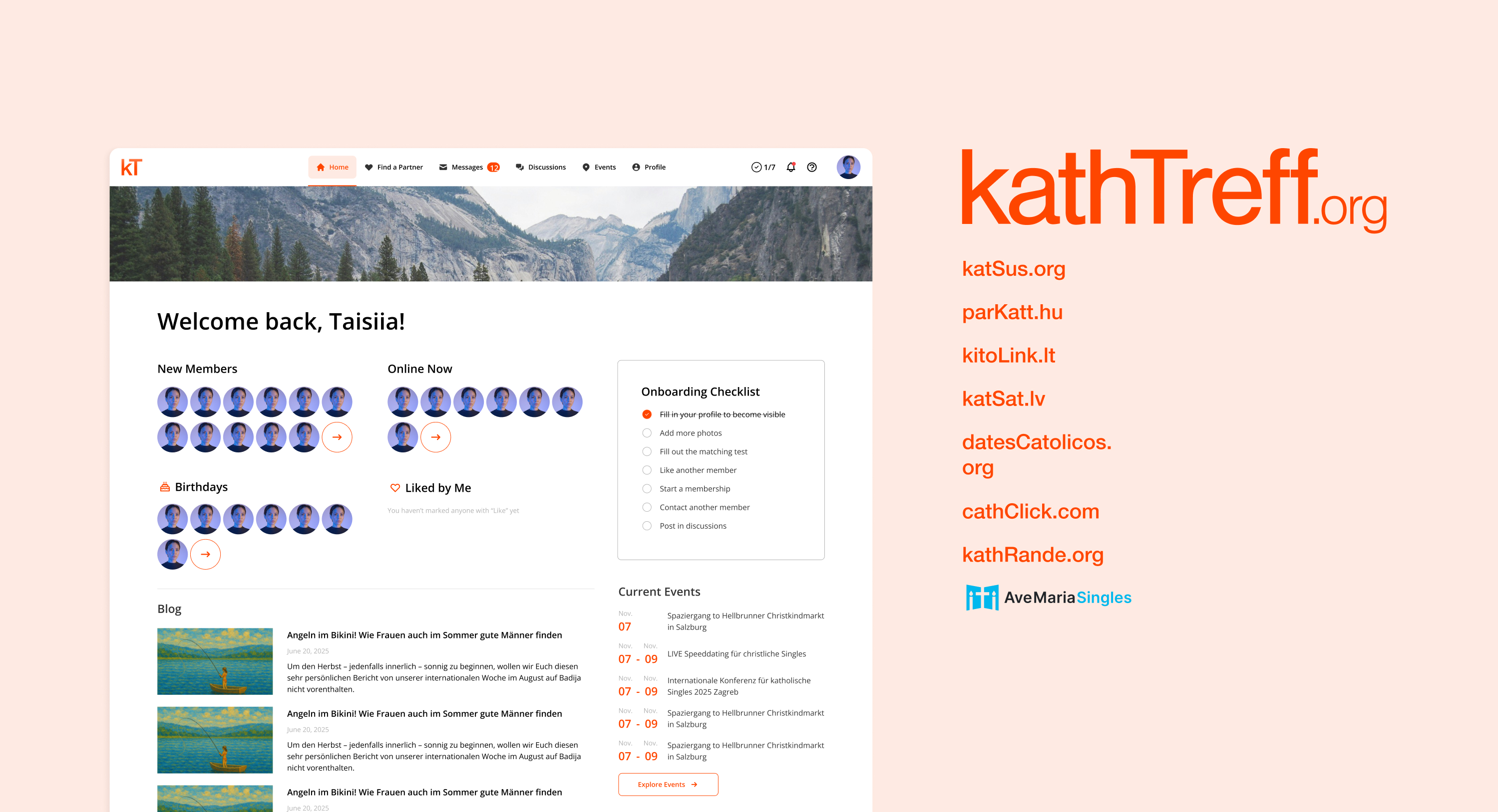
A design system and full web-app redesign for a Catholic dating platform rebuilt from the ground up. One shared backend quietly powers ten country-specific sister communities. I designed every screen and the token system holding it all together, while a new technical architecture was being built alongside it.
kathTreff is a Catholic dating and matchmaking platform founded in 2005 in Vienna, with membership open to anyone 18+, Catholic or preparing to become Catholic, and free to marry under church law. One shared backend powers ten country-specific sister communities — kathTreff, parKatt, katRande, katSus, katStik, kitoLink, katSat, datesCatolicos, cathClick, and AveMariaSingles. The platform’s previous development team had moved on, so this wasn’t a refresh: INFOUND, where I worked as designer, was building the entire new technical architecture from scratch, and the UI had to be designed ahead of and alongside it.
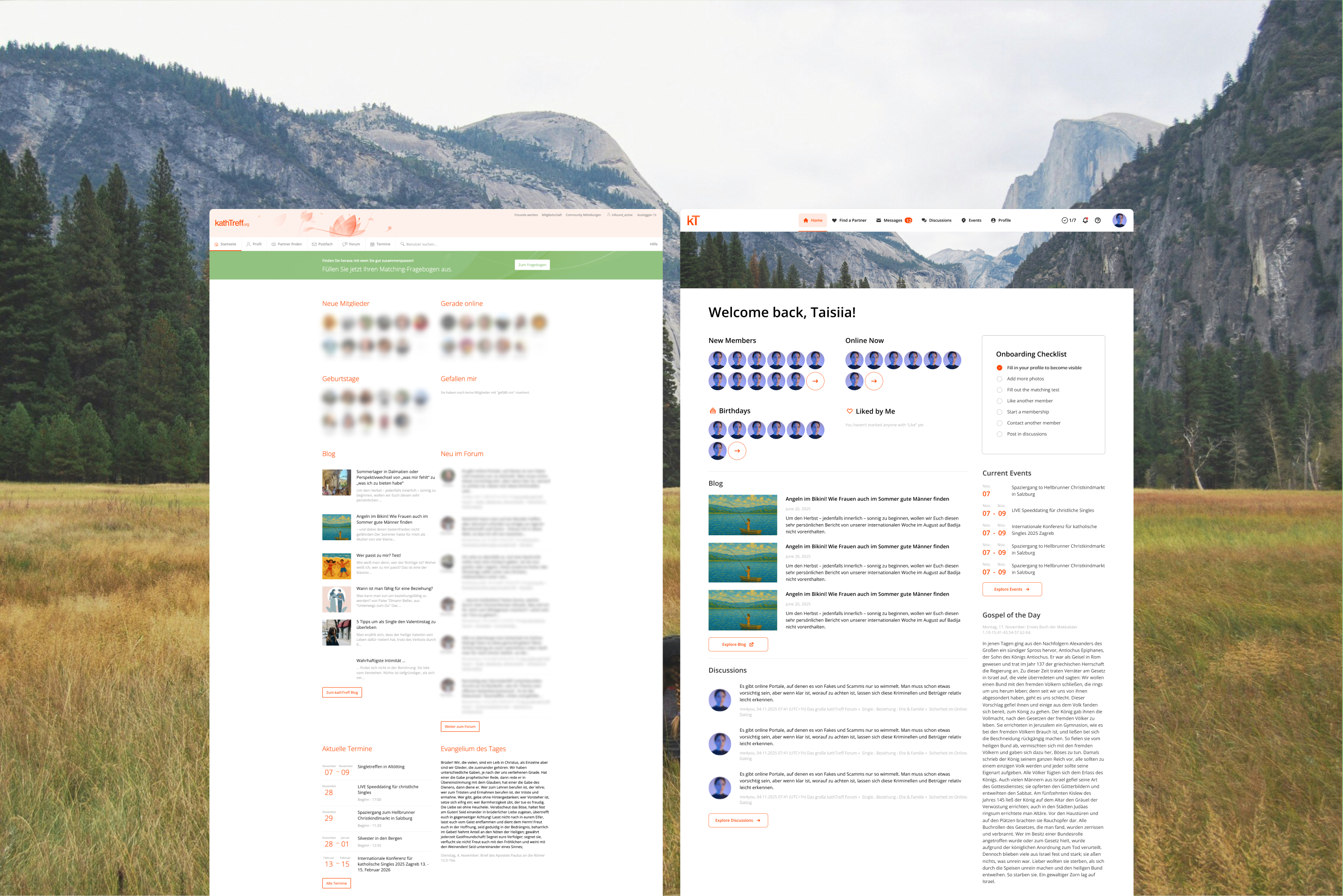
The live platform had simply aged — the top bar alone stacked two levels of navigation, cramming in far more entry points than people needed to see at once. Some parts of the new backend didn’t have a visual layer yet at all, so this wasn’t just a refresh: pieces of the system needed an interface defined for the first time.
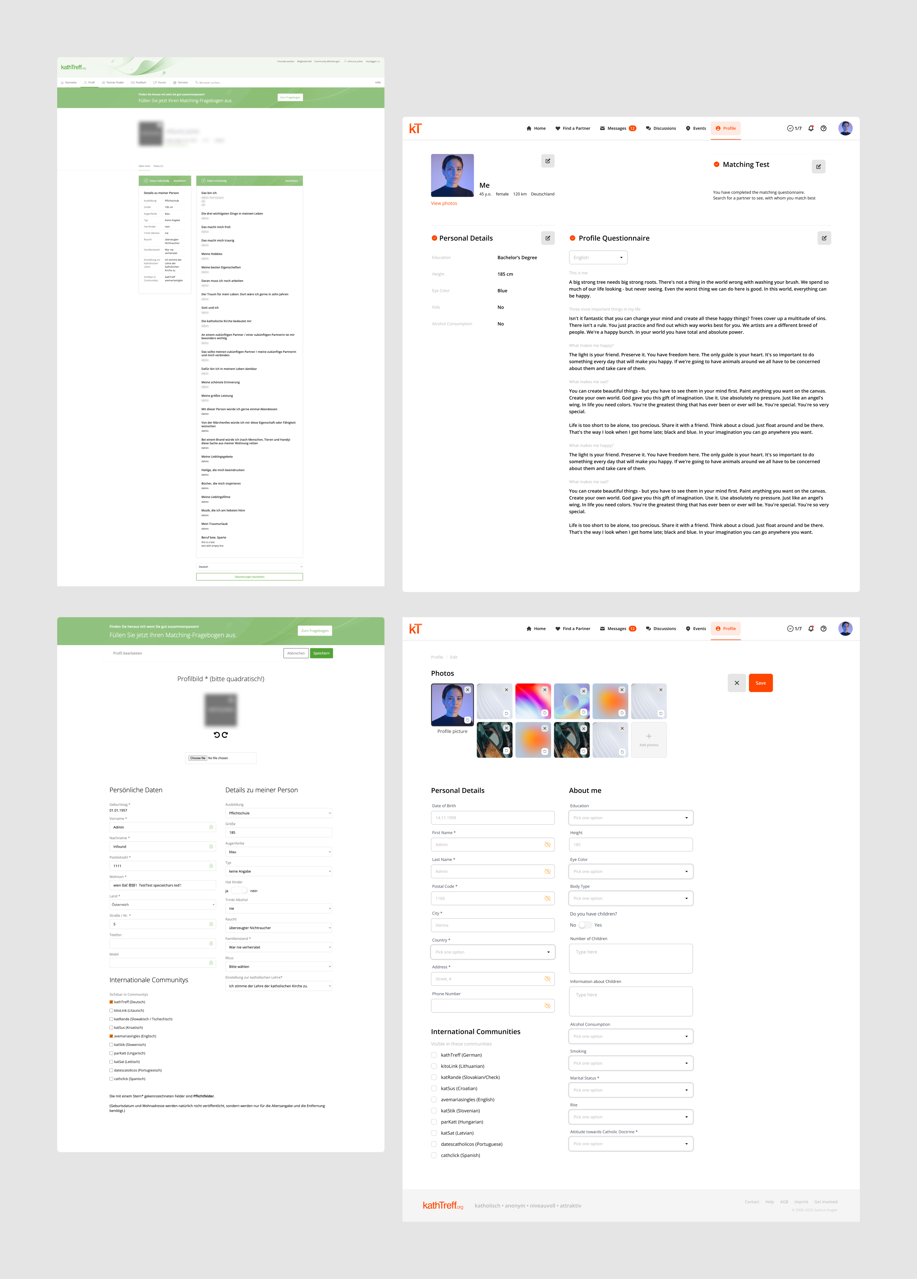
Before designing a single new screen, I audited the entire existing system. I noted down and collected every UI pattern already in use, and a side-by-side of its core screens. One detail from that audit set the direction for everything after: the kathTreff wordmark re-rendered in eight different community colors, proof that any component built next had to hold ten separate brand identities without forking into ten separate designs. That meant building a token system first, rather than starting from screens.
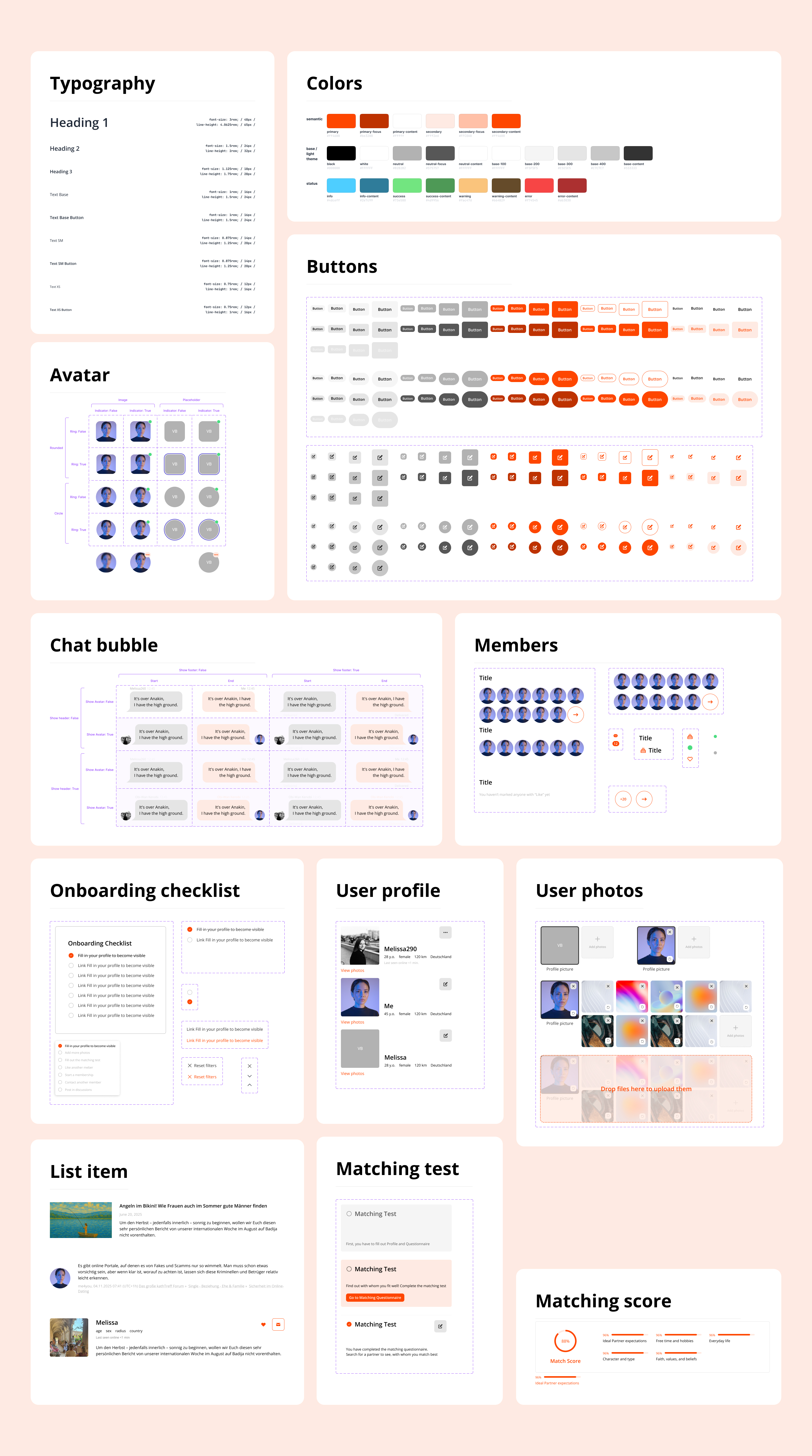
An engineering-ready design system: semantic tokens (primary, secondary, base/neutral, and paired status colors), a modular rem-based type scale from Heading 1 down to Text XS, and a full component library — buttons, form fields (input, select, checkbox, radio, toggle), navigation (navbar, tabs, breadcrumbs, pagination), and content patterns (avatars, tags, tooltips, banners, accordions) — built so a community’s brand color drops in without touching individual screens.
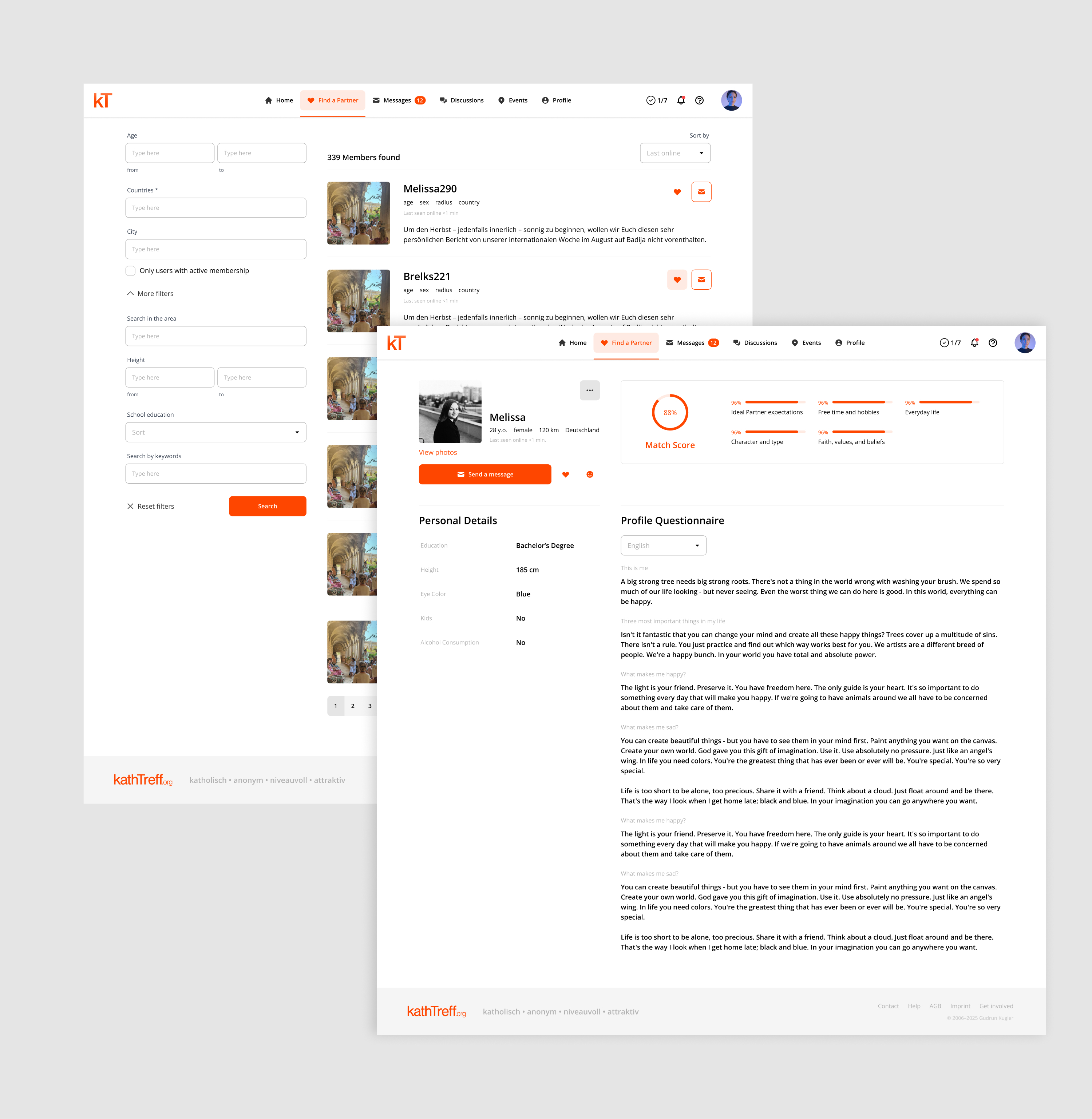
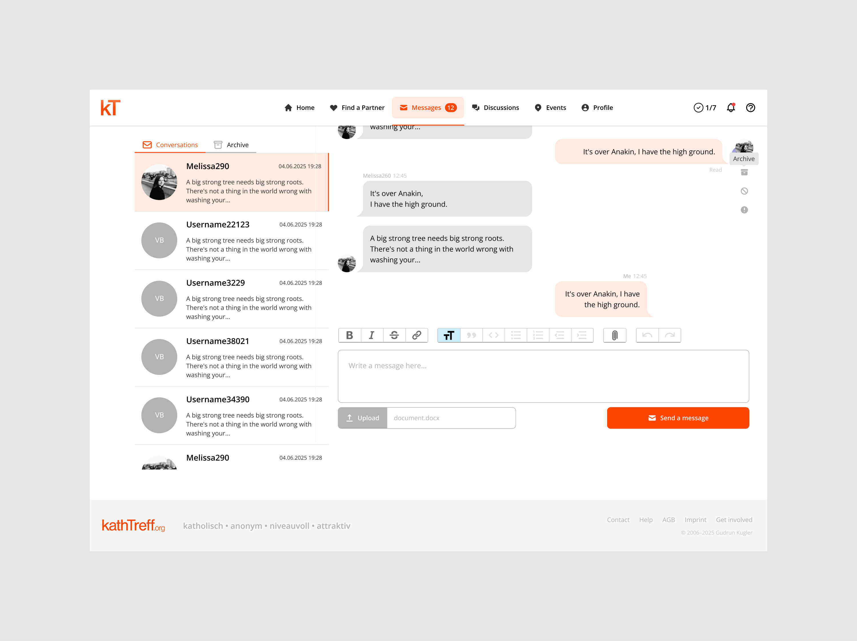
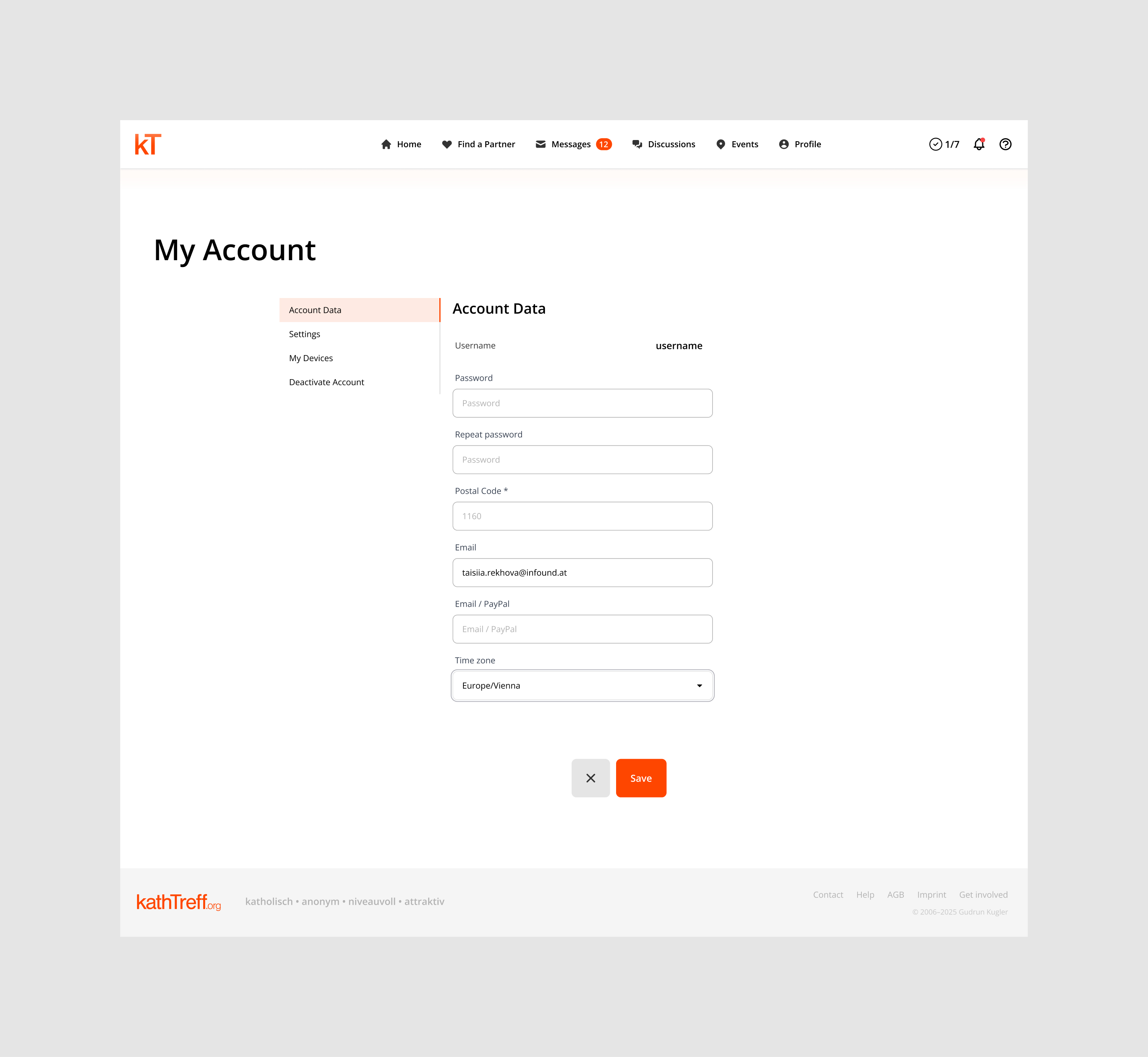
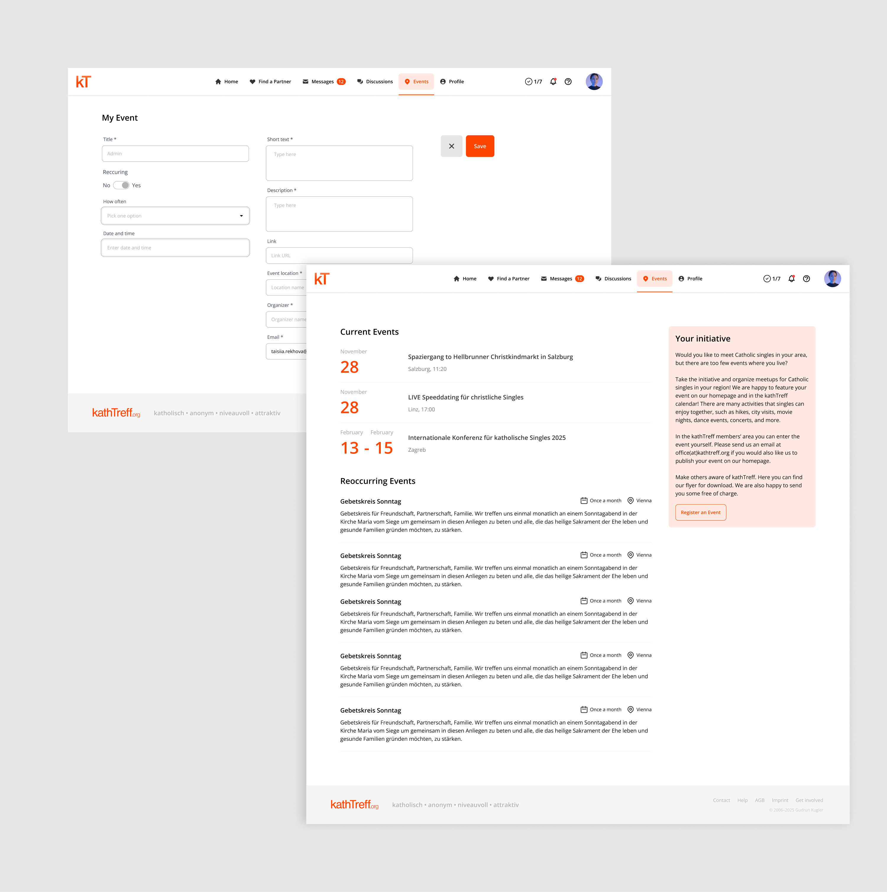
Full screen coverage across the app’s core areas: the Home dashboard, Profile, Find a Partner search, Messages, Discussions, Membership, Settings, Notifications, and Events — each redesigned within the same token system, so switching between a community’s ten different brand colors never means redesigning a screen from scratch.
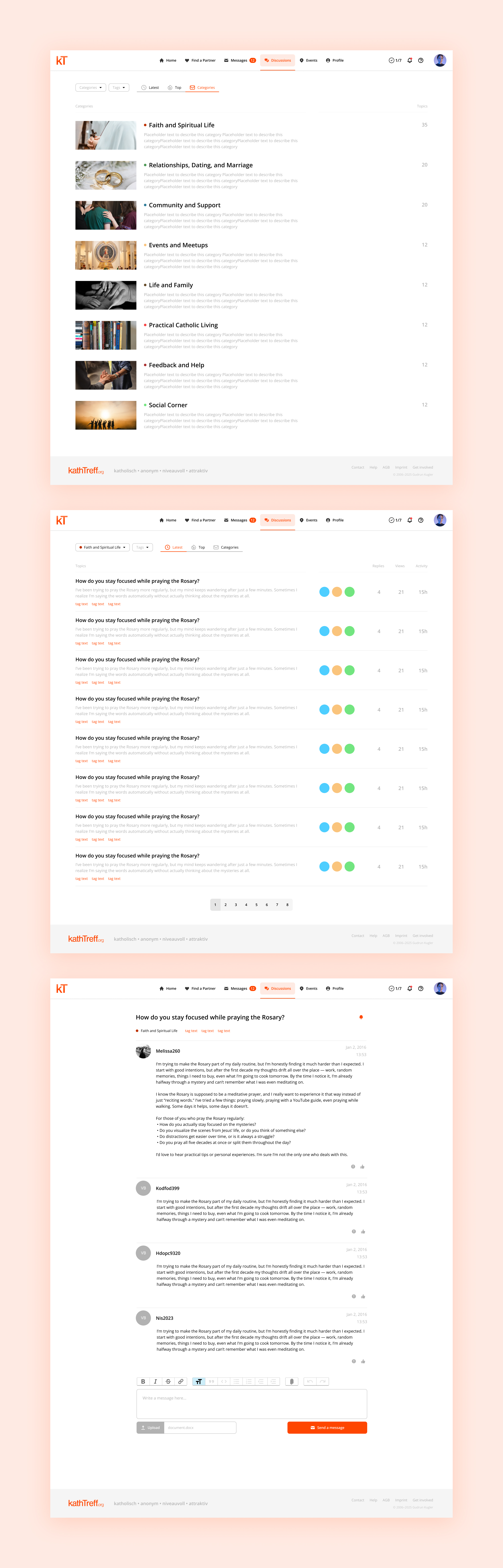
Beyond redesigning what already existed, a few things were introduced for the first time. A unified Discussions system replacing ten communities’ separate, patchwork forums with one shared, Reddit-style Categories → Topics → Posts structure. An Onboarding Checklist on the Home dashboard that sequences new members from profile to first message step by step. And a progress bar on the Matching Test, giving people a clear sense of how much is left as they fill it out.
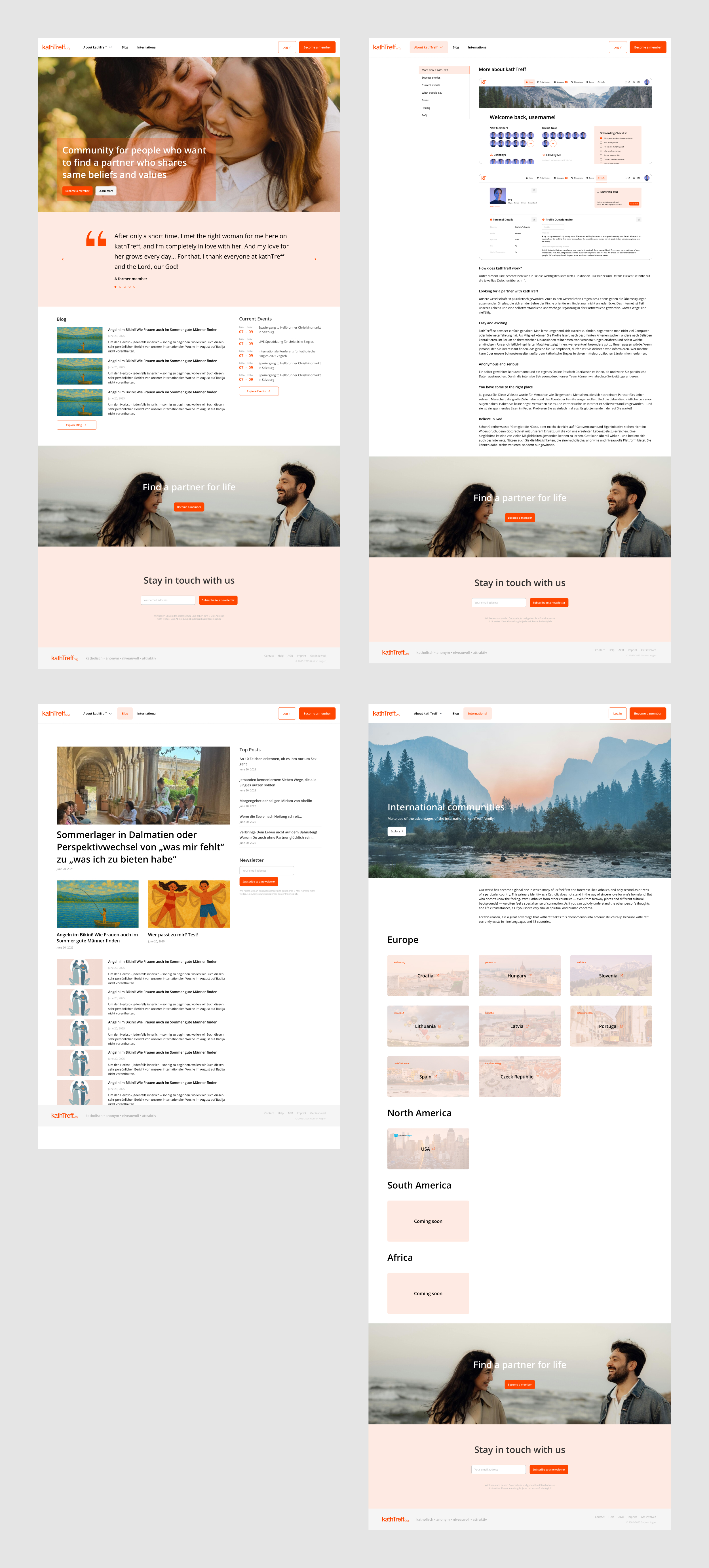
The same visual system was extended into marketing website templates, reused across each community’s own homepage — including a dedicated build for cathClick, the newest community, still under construction.
I create websites, apps, and interfaces that people can enjoy.