
Molnia
Molnia had an extensive library of helping guides – I was asked to improve the usability of the website, while making Molnia brand more visible. I ended up splitting this task into two: improving the UX and navigation of the website with the guides library and designing and building a marketing website for Molnia.
Molnia is an independent, Russian-language human-rights project that helps students handle the draft, expulsion, and university bureaucracy. Molnia also runs educational courses, conducts research, develops step-by-step guides, and even historical games.
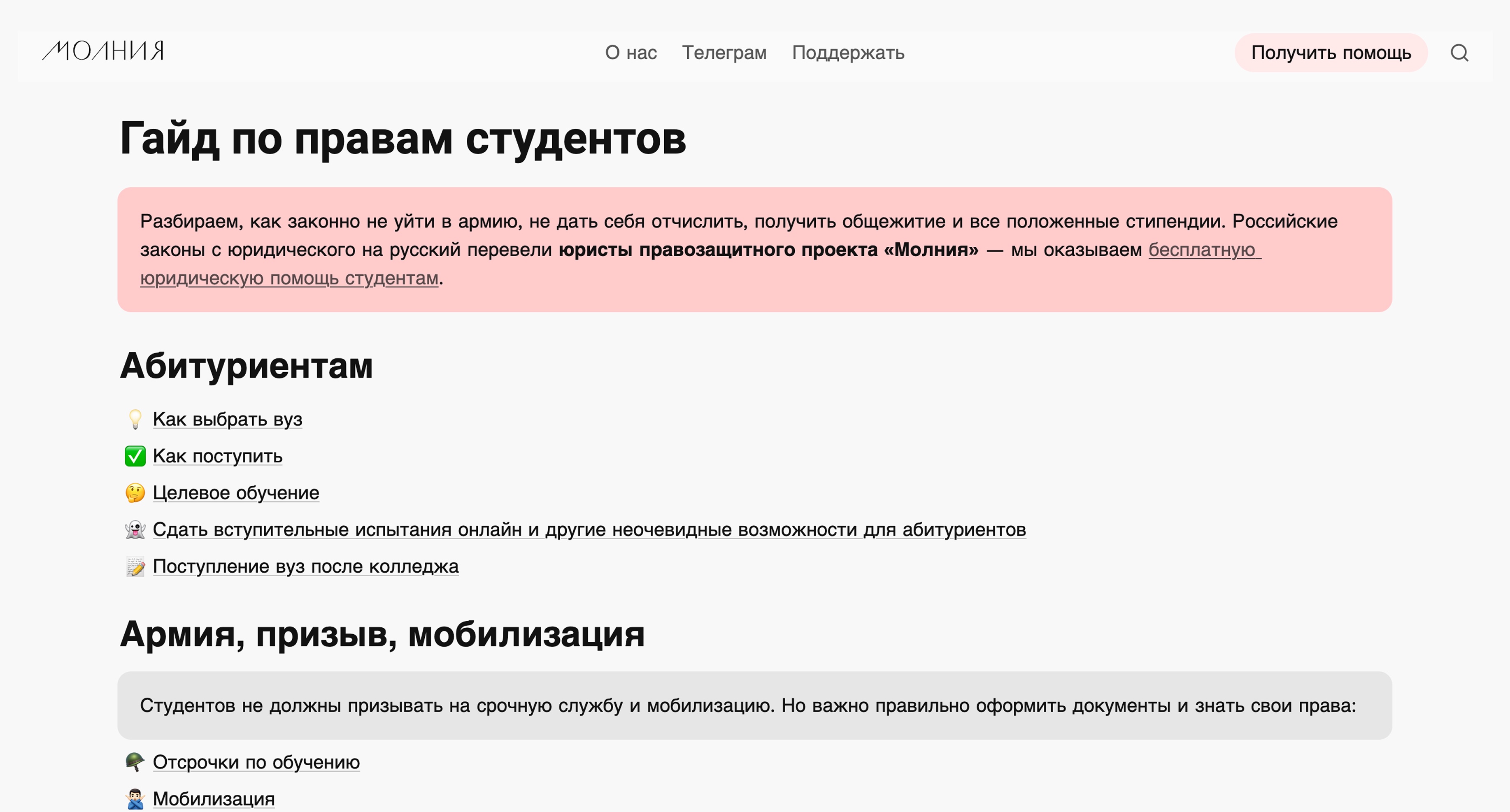
Molnia’s main site was essentially a library of guides for students on relevant topics. An audit of the site found a steady 500–700 visits a month from search, but also showed that the most-clicked button on the homepage was “About Us” — a sign that visitors wanted to understand who Molnia was. The site’s main action — free legal help — visually took a back seat to the “About Us” and “Support” links, and long guide articles had no internal navigation, so readers often left without finishing.
The brief asked for a redesign of the existing site. I proposed a different structure: split it in two. Notion and Super, which the site was built on, are made for structured, easily-editable content — exactly what the guide library needed, letting the team keep updating it themselves without touching code. That stack, however, is quite limited in its design possibilities for a persuasive landing page. Keeping the library where it was, and building a new front door in Tilda, let each site do its own job.
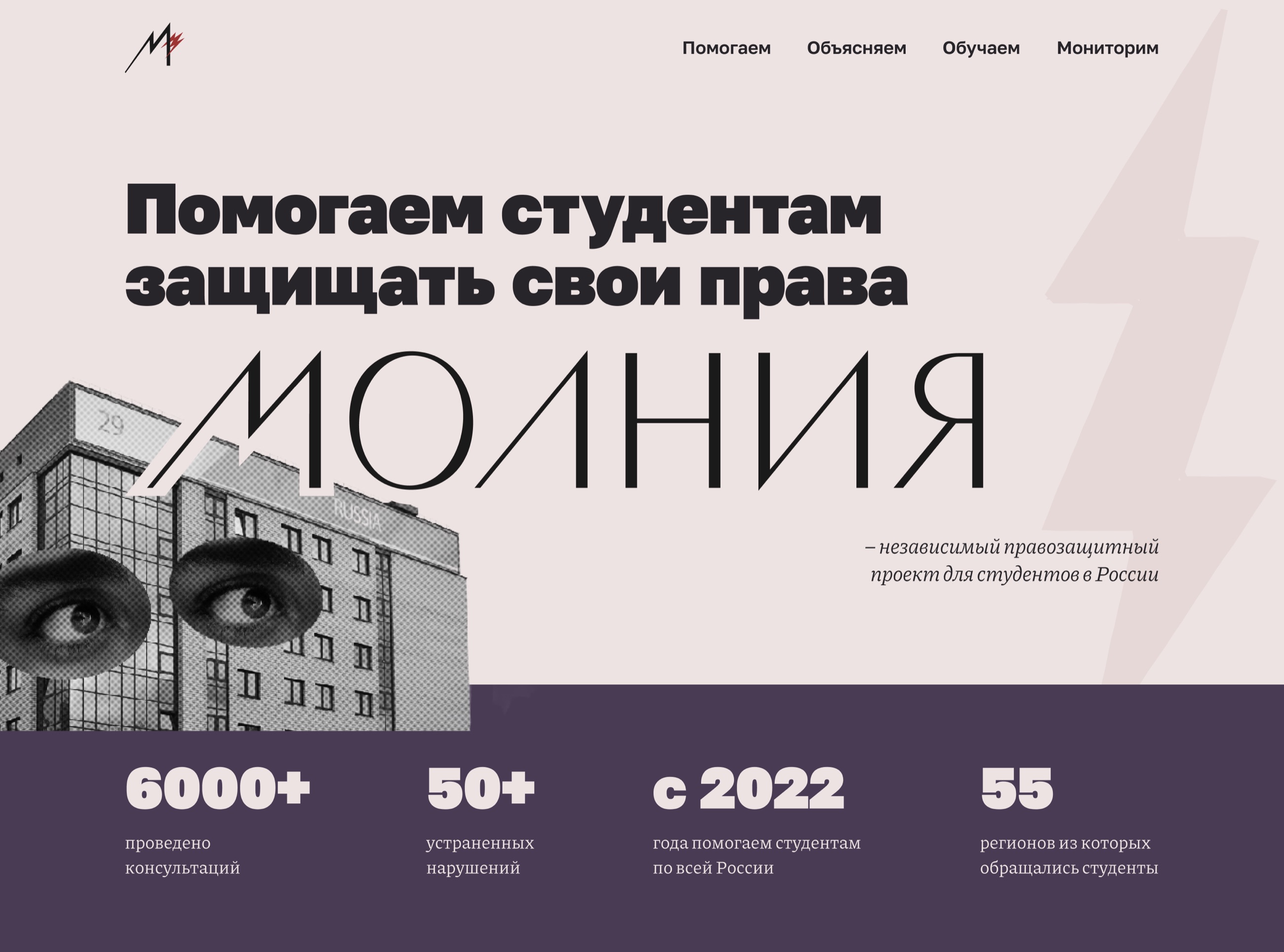
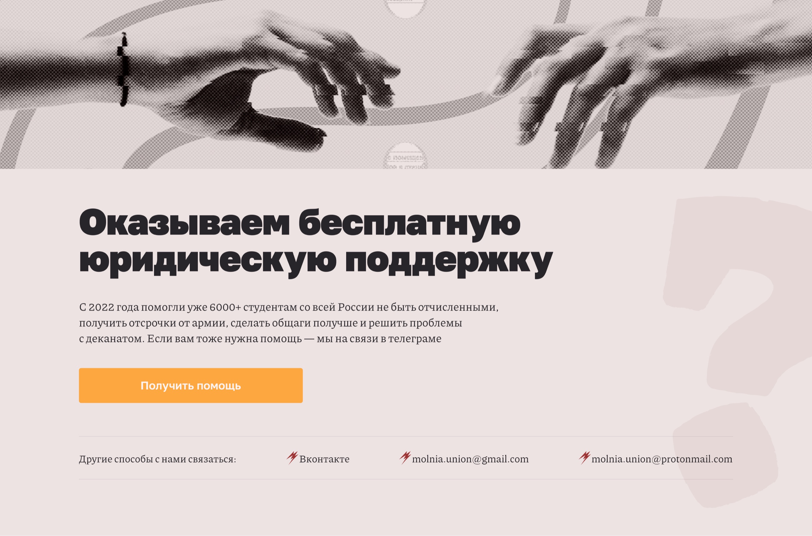
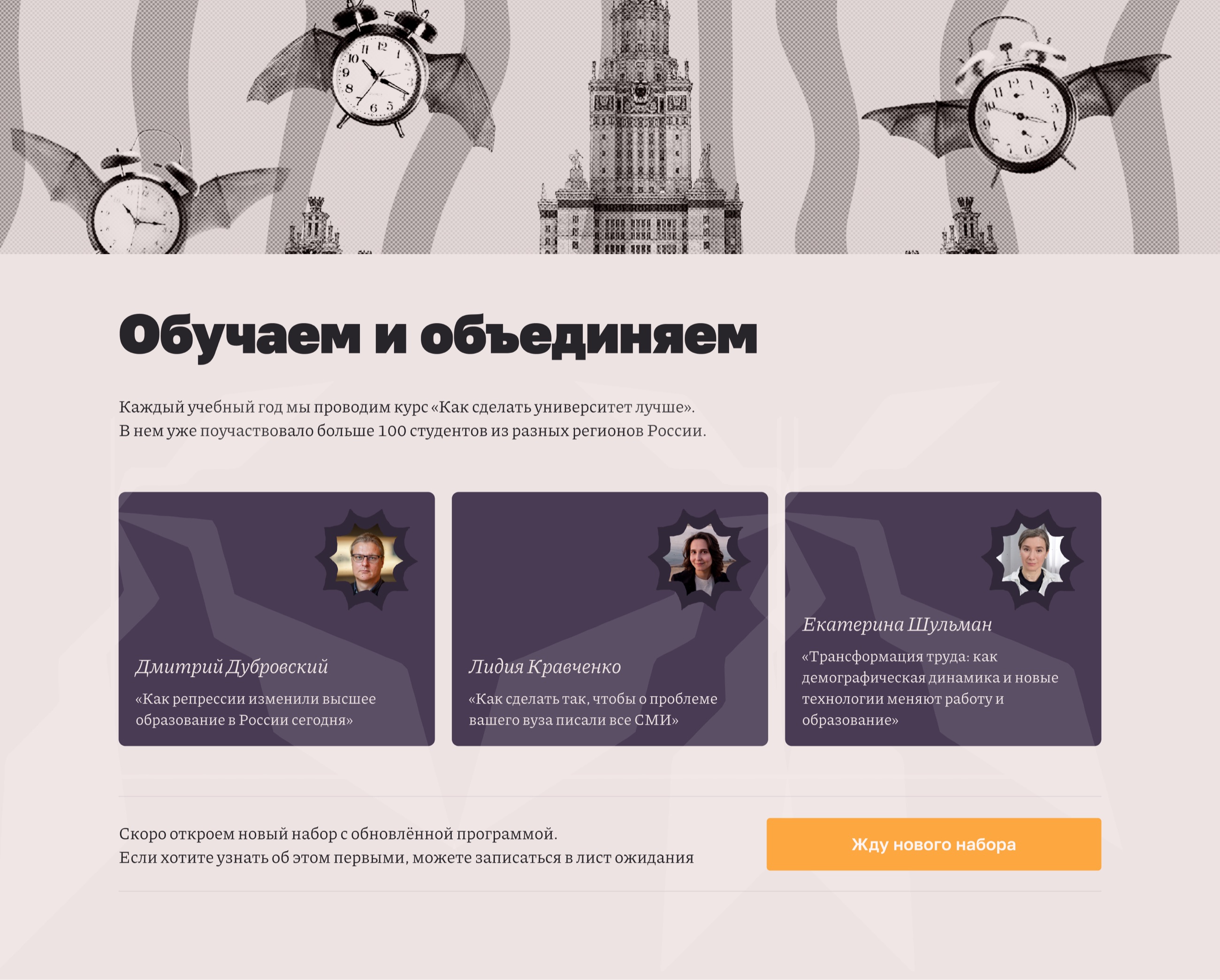
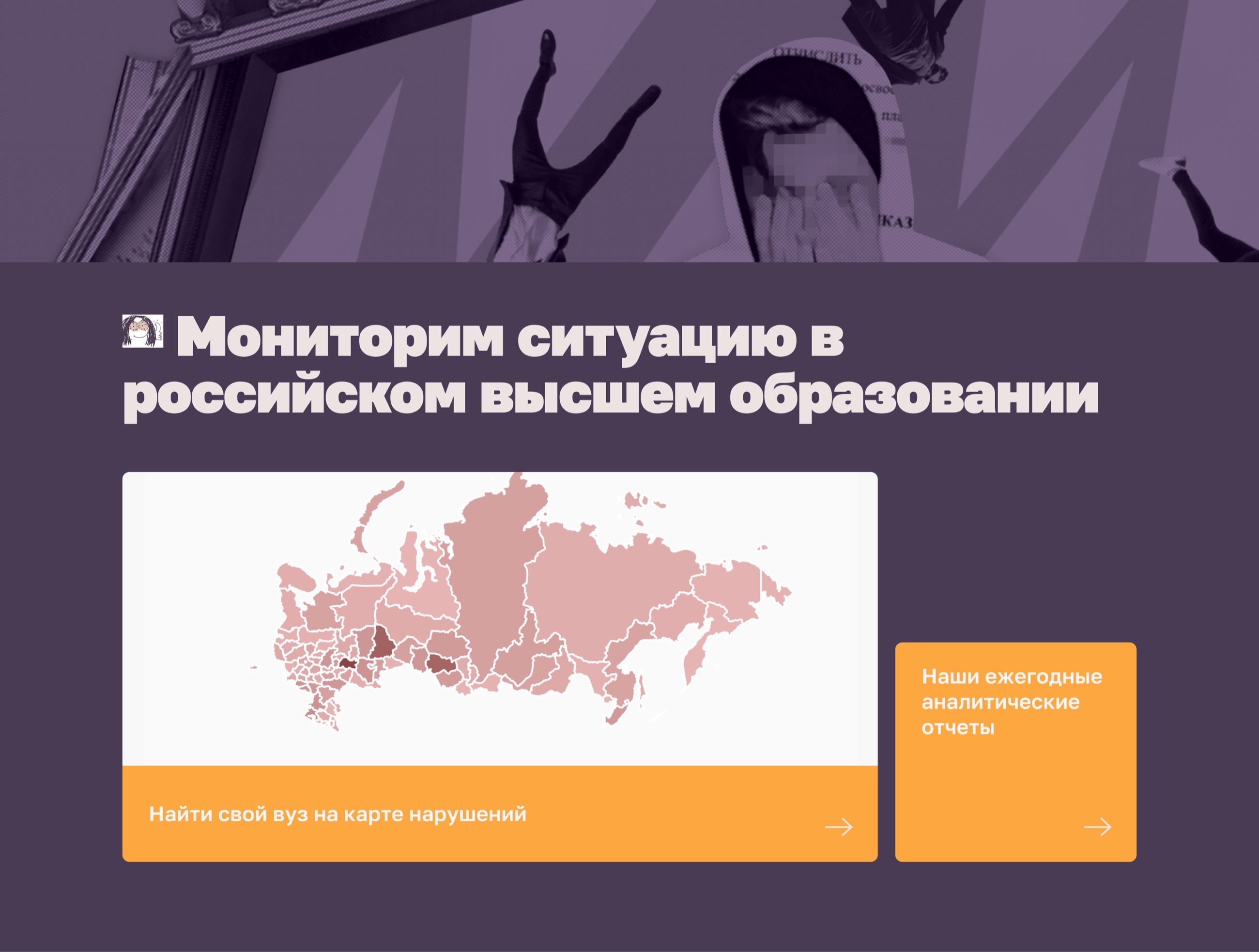
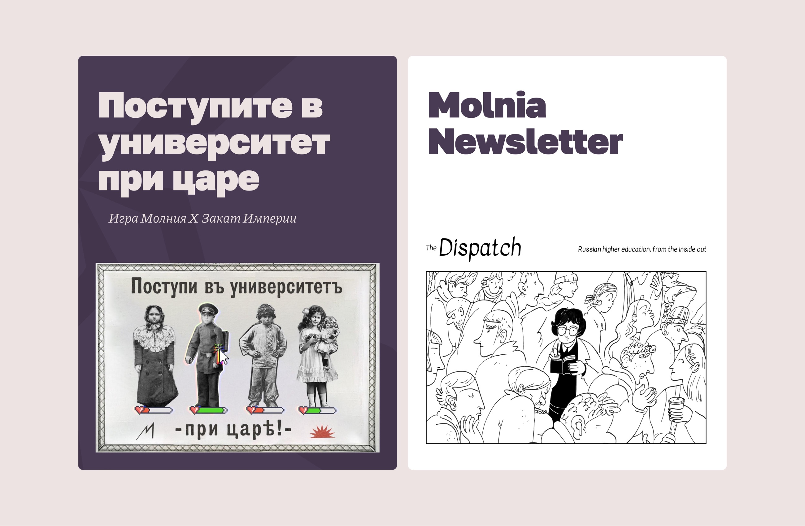
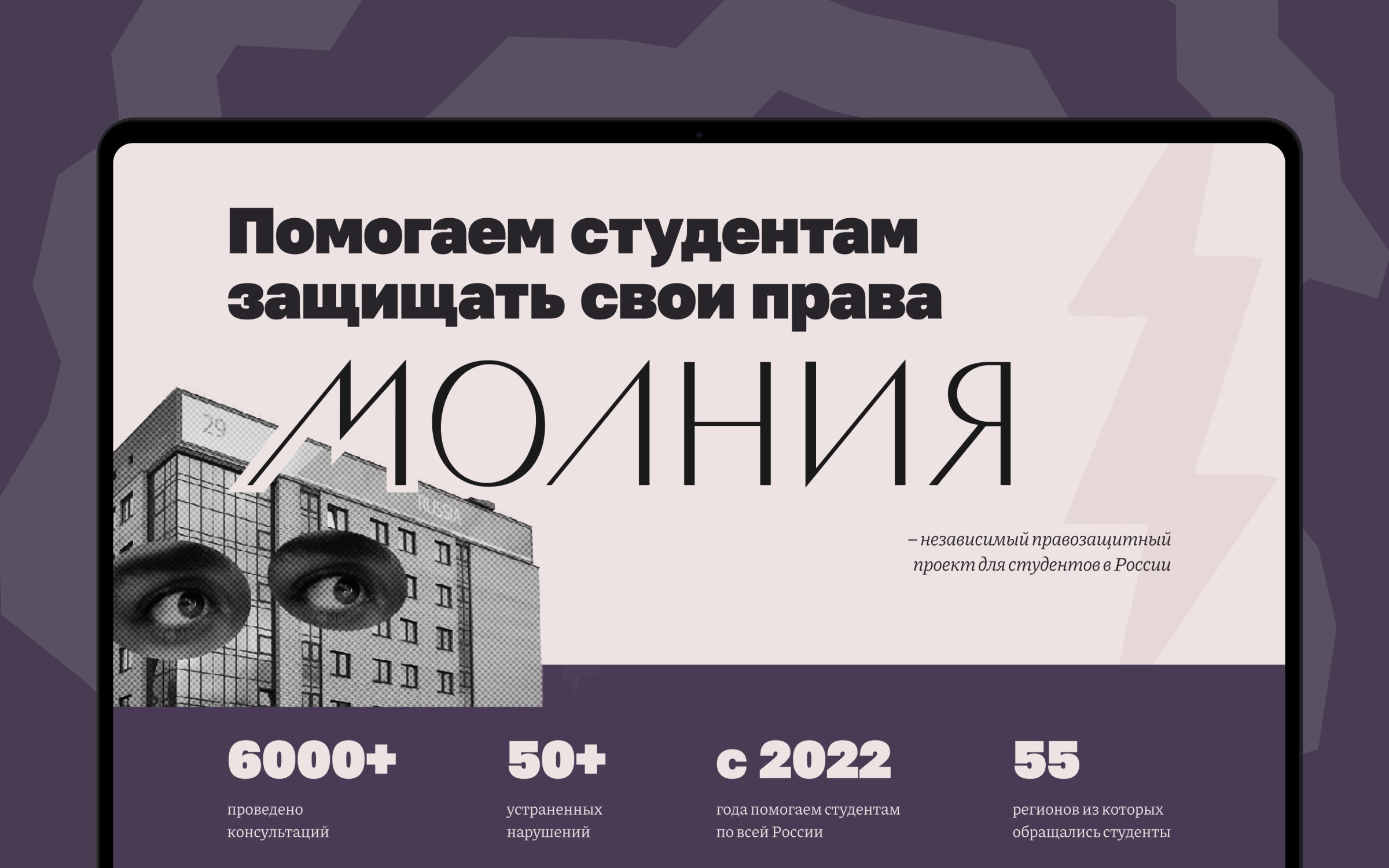
The homepage is now the place to learn everything about Molnia: not just the legal help and guide library, but also the educational courses, research, games, and newsletter. The four main areas of work are shown right in the navigation, so visitors immediately understand what Molnia does.
The site also brings together all the important links — to the guide library, Telegram, the help hotline, and social media.
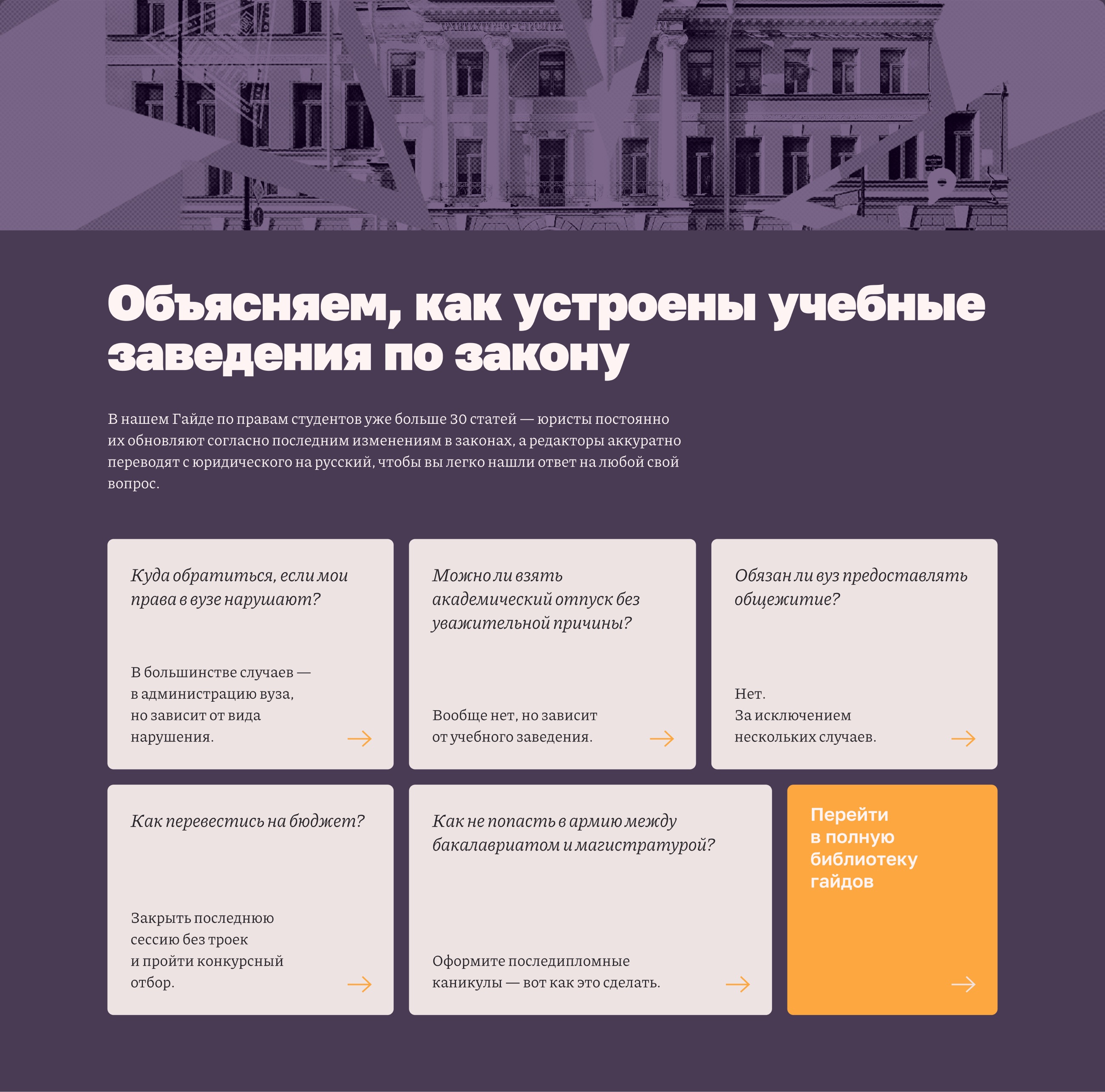
The guides — the most important material — are presented as an FAQ: we picked the five most popular questions and turned them into cards with a short answer. Enough to spark interest and send readers on to the full guide on the library site.
The visual language carries over from the social media and info-card designs, keeping the Molnia brand recognizable.
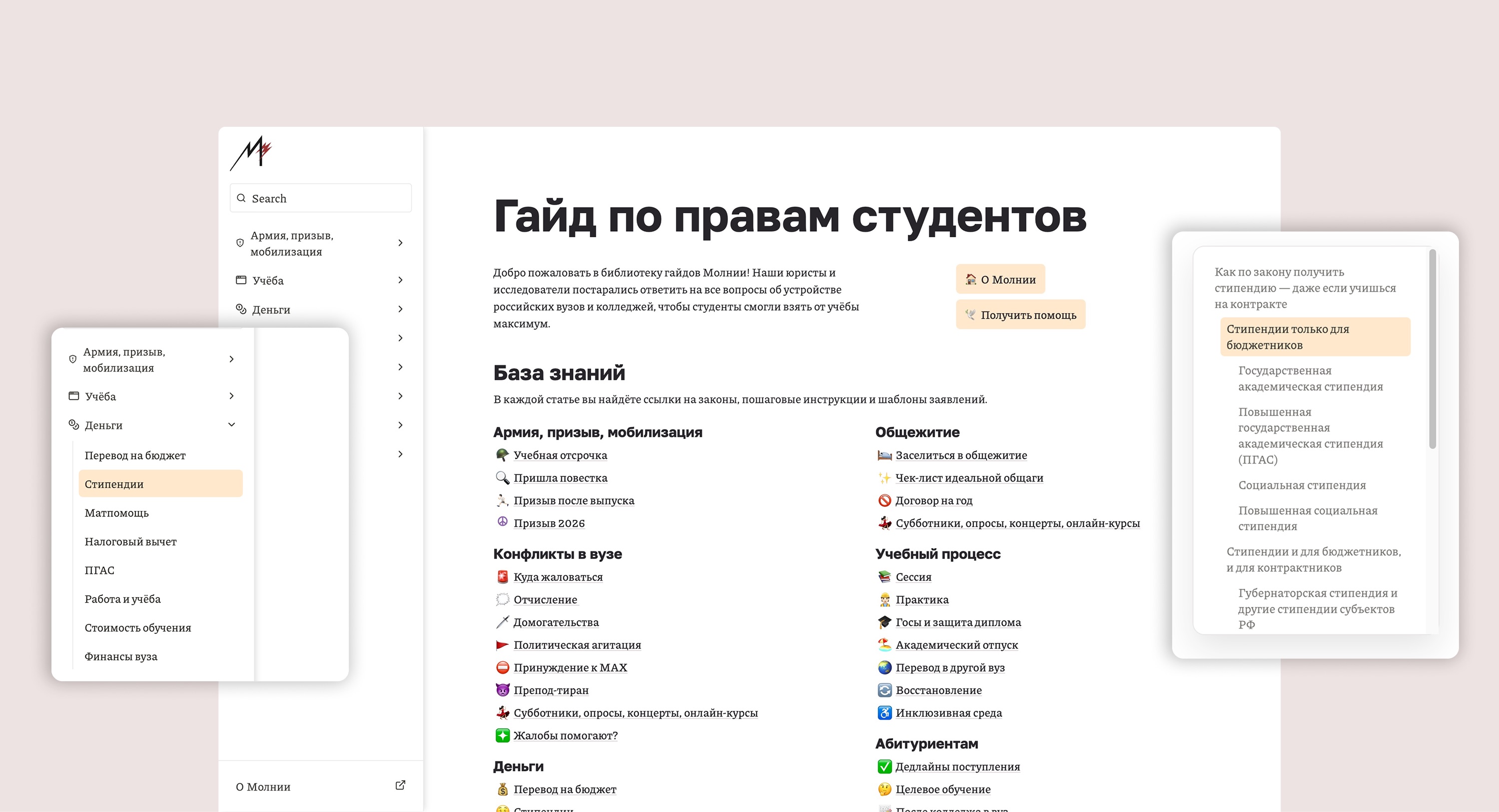
The library’s structure and style were both updated. The top navigation was turned into a sidebar, which suits a large number of dropdown lists with a lot of material much better. The sidebar shows guide categories right away, making them faster and easier to find.
A floating table of contents keeps readers from getting lost in an article and lets them jump quickly between sections. This feature was added with custom code.
The sidebar also always includes an “About Molnia” button linking back to the main site. This keeps every button, section, and navigation element the user needs always in view.
One consistent brand was carried across both platforms — typography, accent color, and the illustration set. The library now inherits the visual language of the whole brand rather than feeling like a separate product.
I create websites, apps, and interfaces that people can enjoy.